Apple II graphics: More than you wanted to know
The Apple ][ is one of the most iconic vintage computers of all time. But since Wozniak’s monster lasted all the way until 1993 (1995 if you could the IIe card, which I won’t count until I get one), it can be easy to forget that in 1977, it was a video extravaganza. The competitors– even much bigger and established companies like Commodore and Tandy– generally only had text modes, let alone pixel-addressable graphics, and they certainly didn’t have sixteen colors. (Gray and grey are different colors, right?)
Preliminary
My main source here is going to be Understanding the Apple II by Jim Sather. You might say, why should I read this post then, when I can go to the source? And honestly yeah go do that. What I’ll do here is try to digest it for myself by writing it in a form I find understandable, focused on details I find interesting. I’ll also throw together some looks at my own personal Apple II, maybe an oscilloscope, that sort of thing.
Now, my personal Apple ][plus and the book have something in common: they predate the Apple //e. So this blog post will focus on the original Apple ][ designed machines. So when I talk about graphics mode, you won’t see the 80 column or double-width graphics modes. Those were //e features; there were no provisions for such things on the original models. If this post proves interesting maybe I’ll dig into them later; I have an Apple IIgs, so certainly I can explore //e exclusives. (And Jim Sather even wrote a follow-up book, Understanding the Apple //e)
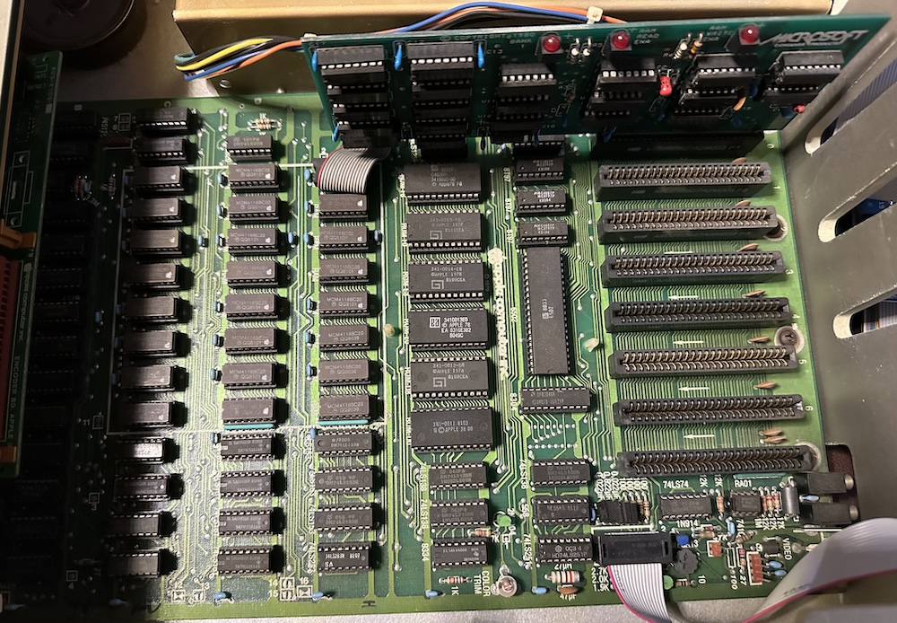
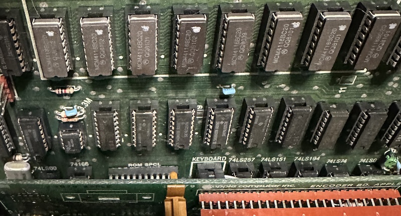
Here is the motherboard of my Apple II plus. It’s serial number 820-0044-01, which despite the 1979 copyright date, implies it’s definitely one of the later Apple IIs of its type– in 1981, the 820-0044-XX motherboard series was created by Apple in order to try to reduce radio-frequency interference (RFI), so this is known as the “RFI” motherboard. Go dig into The Apple II Circuit Description for all the nitty-gritty on motherboard variants.
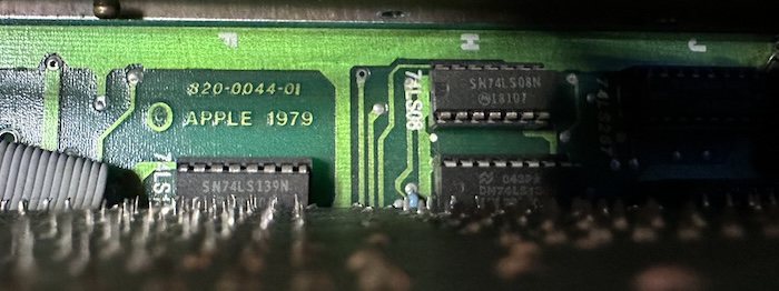
It’s worth noting for those not familiar with the Apple II that the “Apple II” and the “Apple II plus” are the same system, whose major difference is just the ROM. After the introduction of the new ROMs in 1979, there was a period where the same motherboard, when sold with the original Integer BASIC ROM set, it was an Apple II; when Applesoft (Microsoft BASIC for the Apple) was baked in instead, the badge was changed to II plus. Eventually all Apples shipped with Applesoft and the original II badges stopped being used. The internal capabilities are identical, including all the graphics modes I’ll talk about.
Everything but the kitchen sync
Television video systems predate computers wanting to use them. Therefore, they are greedy– a video signal must produce the expected signals at the expected times, or your television will lose synchronization with the signal. Regaining synchronization will likely result in a delay, and definitely a loss of visual signals.
So when the video signal is being drawn, everything else has to bow to the video system’s will. The Nintendo Entertainment System creates a separate world, the PPU bus, for the video system to inhabit, and the developer should avoid touching it unless it’s convenient. Other machine did things differently– the Atari 130XE I recently upgraded the keyboard on uses a variant of the 6502 processor with an extra pin whose sole purpose is to halt the CPU whenever the video chip needs extra time to access RAM. Both the 130XE and the NES have a 1.7MHz CPU, but the NES can run its just a little faster. (The 130XE has literally 64 times the CPU-accessible RAM, it’ll be fine)
The Apple II is a little bit different than that. The CPU can access RAM whenever it wants. The graphics system, known as the video scanner (it’s not one chip), can also access the RAM it needs whenever it wants. How did Woz do this? A clue is hidden in the 6502 datasheets– specifically, this diagram is from the August 1976 “SY6500/MCS6500 Microcomputer Family Hardware Manual”.
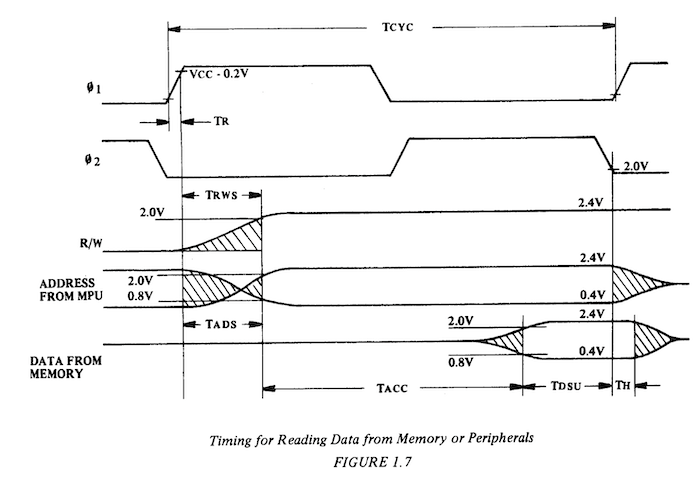
The important thing to note is to look at φ2, the input clock. The data output of external memory only needs to be valid at the very end of the period in which φ2 is low. The entire period when φ2 is high, the 6502 is doing internal stuff, and you don’t actually want its signals to show up on the data bus. So if you have sufficiently fast memory, you can have your memory off doing something else while φ2 is low, and the 6502 will never know the difference.
Now, my understanding is that the Commodore VIC-20 interlaces its memory accesses the same way. But there are three major differences between the Apple II and the Commodore VIC-20. Well, okay, there’s more than that. But there are a few particularly relevant ones:
- The VIC-20 uses static RAM. The Apple II’s video scanner also handles DRAM refresh, while the Commodore doesn’t need to worry about that.
- The VIC-20 has no directly-accessible-pixel screen modes.
- The VIC-20’s Video Interface Chip is, well, a chip. A highly integrated circuit that is opaque to exterior analysis, and with room for extra logic to simplify the external interface. The Apple II video scanner is constructed out of easily-analyzable discrete logic, and wears its implementation details on its sleeve.
It’s that last one that I think is really important here. A lot of the fiddly details of the Apple II’s video that a programmer has to put up with could have been papered over with a few extra logic gates, internal registers, and buffers. On an integrated circuit this wouldn’t be a big deal as long as everything still fit within the planned mask size. But Steve Wozniak was building the Apple II out of discrete logic, and Apple paid for each one of those chips. So it was in the interest of cost-effectiveness that Apple offloaded some complexity to the programmer.
What frequency is it anyways?
Let’s talk about pixels. The Apple II has a core oscillator at 14.318180MHz (“14M”), which is divided by two to create a 7.15909MHz (“7M”) signal, and then divided again to create a 3.579545MHz signal. This latter suspiciously-specific frequency is the NTSC “colorburst” frequency. 7M is our pixel clock; during active display, a pixel is output every (1 / 7.15909MHz). A division of 7M by 7 gives you 1.0227MHz, which sounds like the 1MHz CPU clock. But is it?
The horizontal scanning rate of NTSC television is 15.734kHz. PAL is 15.625kHz, but we’ll ignore that which challenges us. That means we have 63.56μs to finish a line, or a quick trip to Wolfram Alpha says that’s 910 clicks of our 14M clock. 65 clicks of 1.0227MHz, 455 pixels (including in blanking periods; 280 pixels the screen actually draws), and therefore 227.5 ticks of our color reference. Which isn’t evenly divided.
That’s actually correct and how the spec expects it, however, we need to keep all the accesses perfectly synchronized, and we want the color reference to also be constant relative to the CPU. (Ever wonder why systems like PC clones don’t always have consistent artifact colors?) So the Apple II lengthens that last 65th clock– it’s the “long cycle”, taking an extra tick. Now the scanline frequency is dropped to 15.700kHz (fine for most TVs), but also now the Apple II CPU clock is not constant, it varies based off of where the screen is drawing. It’s 1.0205MHz on average, but only on average.
Combine that with the knowledge of the Apple II’s audio system and the stock Apple II’s lack of any hardware timers, and this is actually worth knowing. Unfortunately, the Apple II doesn’t give the programmer any ability to know where in its cycle the video scanner is at any given time. (Understanding the Apple II has a few possible mods you can do to your computer to let it know, though!)
TEXT mode
Many vintage computers are defined by their fonts. The PET’s PETSCII is iconic, of course (though probably moreso for its use on the Commodore 64). The TRS-80 had its “pseudographics” characters allowing for very blocky pixel graphics despite only having text mode. And I’ve always enjoyed the thick letters of the Atari 8-bit font, which not only look nice, but also help readability on a system whose text mode is single-color (varying only in luminance) and would be viewed by most users over a noisy RF modulator.
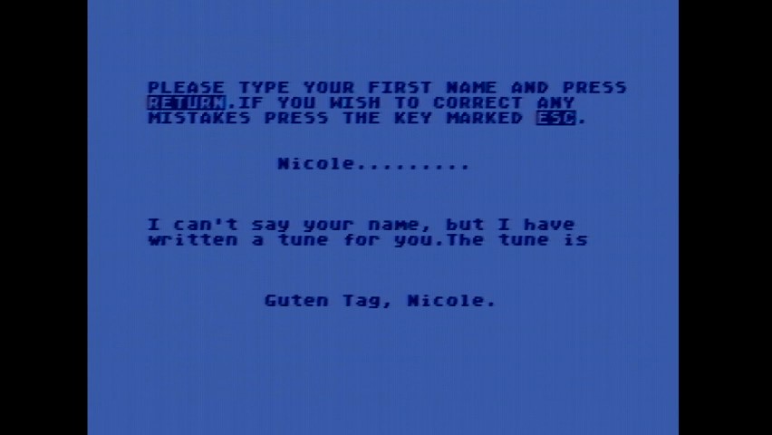
And then we get to the Apple II, with its stark simple character forms, and absolutely no special characters to speak of. (Though at least it has built in inverse and flashing text modes, always useful?) One can easily imagine Steve Jobs in the mindset that would lead to the lack of arrow keys on the first Macintosh keyboard, insisting that since the Apple II’s standout feature was its graphics modes, there would be no special incentives to create pseudographics with text mode.
You could think that, but you’d be wrong. Early revisions of the Apple II used the Signetics 2513 character generator ROM. This was a commercial, off the shelf part. You can go find its datasheet online.

This was a popular part that Woz had used earlier in the Apple 1, and was a popular use for hobbyist projects like the famous 1973 TV Typewriter. So the message the Apple II font actually sends is “hey tinkerers, this is for you”. Now later models of the Apple II, like my II plus, use a more standard mask ROM instead of this weird 5-bit character-specific ROM; you can even mod it to put your own EEPROM in. On my RFI board, it’s “ROM SPCL” deep under the keyboard.
Despite the Signetics ROM being only 5 pixels wide, text characters on the Apple II are 7 pixels wide. But why 7? Well, the reason is all that screen math again. The memory access clock is 7M divided by 7 to get the memory timing; so you have one memory cycle to get 7 pixels. We have 40 columns in the visible area, and 24 rows, fine for low resolution text mode. Pretty basic, right?
Memory layout
The official Apple Apple II Reference Manual, signed by Woz on the cover, provides some detail on the memory layout that starts to be a bit concerning.
The area of memory which is used for the primary text page starts at location number 1024 and extends to location number 2047. The secondary screen begins at location number 2048 and extends to location 3071. In machine language, the primary page is from hexadecimal address $400 to address $7FF; the secondary page is from $800 to $BFF. Each of these pages is 1,024 bytes long. Those of you intrepid enough to do the multiplication will realize that there are only 960 characters displayed on the screen. The remaining 64 bytes in each page which are not displayed on the screen are used as temporary storage locations by programs stored in PROM on Apple Intelligent Interface (r) peripheral boards (see page 82).
You might wonder why they’re giving memory addresses in decimal– well, that was pretty normal for 70’s and 80’s computer manuals. You might also wonder why they’re so desperate for RAM that such a small amount of extra RAM would be in demand for peripheral cards– well, the original Apple II was sold with a base RAM configuration of 4kiB, so no addresses above 0x1000 would exist.
But the real question is how that memory is laid out. The Reference Manual just gives a screen map, but it doesn’t tell you why it is the way it is. My scan of this isn’t great, but you can see that the rows are very much not sequential.
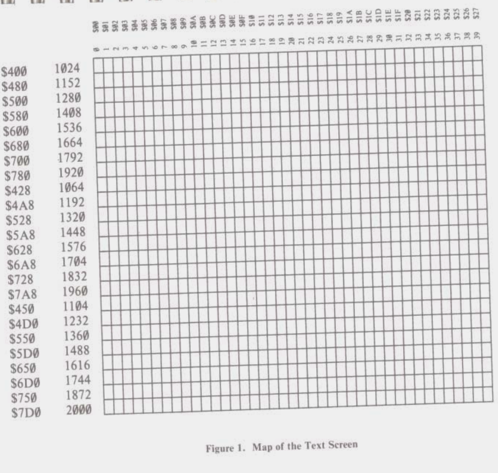
I’ve called the Apple II screen memory layout bizarre before, and from a programmer’s perspective, it really is. But I was also criticized for that– because Steve Wozniak is really doing something quite impressive here. You have to understand the constraints he was under.
- Use as few chips as possible. Each piece of discrete logic costs money. So wherever possible work with the signals you have– the binary counters that are used for all that counting logic, for example.
- But don’t waste RAM. The constraints of the television standard give us 40 columns wide. That’s not a simple binary number; you could have a gap after every text line, but that’d give 24 small areas of wasted RAM.
- Refresh DRAM. DRAM addressing is pretty complicated, relying on “row” and “column” signals. But long story short, when going through the screen to display video, you also need to access every “row” address every 2ms. A 60Hz frame is 16.67ms. (Note that each chip is either 4kiB or 16kiB, so if you refresh the right range in one chip you can simultaneously refresh the rest)
I’m not going to go into the full detail of the design because I think I’d just be repeating Jim Sather’s book in full here. But more-or-less, the screen is divided into three areas: top, middle, and bottom, each of eight rows. Then, the memory page, let’s use the primary text page 0x400, is divided into eight subsections of 128 bytes each– 128 bytes gives us something our binary counters can easily catch. Each of these 128 byte sections is as follows:
- One row of 40 characters for the top area
- One row of 40 characters for the middle area
- One row of 40 characters for the bottom area
- One 8 byte “screen hole” given to the Apple Intelligent Interface (r) peripheral boards
In order to refresh a larger part of the screen during TEXT and LORES modes, the video scanner actually accesses different addresses during the horizontal blanking period, which allows it to refresh a wider range. These are wrong for video, but there’s no video during the blanking period. It doesn’t need to do this in HIRES mode, so it doesn’t.
From the programmer’s perspective, this usually just is papered over with a lookup table, and isn’t a big deal in the end.
HIRES mode
The Apple II offers no ability to customize the blocks in text mode; that Signetics ROM could not be replaced with RAM. This was the case for all three machines of the 1977 “Trinity”, but later Commodore machines would allow it. Unlike the other two “Trinity” machines, though, Apple lets you address the screen pixels directly.
With 40 bytes per row, and 24 * 8 = 192 rows in the visible area, you’d need at least 7.5kiB for just one screen. So we’ve abandoned the 4kiB Apple II users here– the 4kiB Apple II was not on the market very long though, and the upgraded 16kiB was the low-end model for most of the late 70’s. By the time of later models like my plus, 48kiB was more or less assumed anyways. With 16kiB you get one HIRES page at 0x2000, with 48kiB you can get a second one at 0x4000. (Double-buffering in 1977?) Of course, that’s a lot of RAM, so if you don’t need it a program will probably use it for something else.
Now, there’s an interesting problem that HIRES memory has to handle– the addresses and layout for text mode are very carefully chosen and set up to allow DRAM refresh. But now we need to get eight times as many addresses, with as few changes as possible. How do we do it? HIRES mode uses higher address bits, which are mapped to the DRAM “columns”, mostly not impacting the careful dance of refresh. But this creates a pretty wild memory layout.
Apologies to the colorblind for the graph above! In fact, maybe I should just apologize to everyone with eyes. The SVGs are an experiment, we’ll see how they go.
Essentially, the HIRES memory space is divided into eight sections. The first section is the top row of pixels for each 7x8 text mode tile, the second section the second row, etc. etc. Each section (the large colored blocks in memory above) is itself laid out the same way as TEXT mode, complete with some screen holes. Confusing? Sure, but again, most programmers made a lookup table or two and called it a day. Each byte has seven pixels, the first bit being ignored. (The bits are also pushed to the screen in opposite order to how they’re usually written, but this is all just convention anyway)
Color
Everything I just described is good enough for business software and users of the monochrome Monitor ///. But this is an Apple II, the ultimate gaming PC of 1977. We want color. You probably know about “NTSC artifacts”, but what does that mean? And that’s where all our timing synchronization comes into play.
Imagine the Apple II drawing an alternating pixel pattern, 0101. It draws those pixels at the rate of its pixel clock, 7M. An important thing to remember about square waves is that the frequency is the frequency of a complete cycle, both the “up” and “down” of the wave.
That is to say, if you alternate pixels, you’re creating a signal that repeats at the colorburst frequency! This is a real color signal, just like you’d generate if you had one of those fancy TMS9918As or something, but it’s being generated using the same mechanism that generates the pixels. (Sure, it’s a square wave here, but that’s what signal filters and such are for) Also, as the programmer, you get to control it directly.
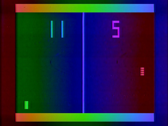
This is a screenshot from Atari’s Pong Sports IV, which like Atari’s other Home Pong series of consoles, uses a slightly out of phase crystal to create a cool rainbow effect. Obviously that isn’t possible here– with such strict pixel timing, we can only create two color phase shifts. And now you know why the “long cycle” that keeps the memory accesses in sync with the colorburst frequency is so important, or the phase shifts would also be different on each scanline.
I deliberately used the chosen colors above because they are not the colors generated, because I don’t necessarily have the phase relationships perfectly correct. Take the diagrams above as basic conceptual scribbles, not necessarily oscilloscope traces– the point is, there are two signals: one in phase with the colorburst, one 180° out of phase with the colorburst. But the colorburst is itself defined as 180° out of phase with the color carrier, so this is a bit complex.
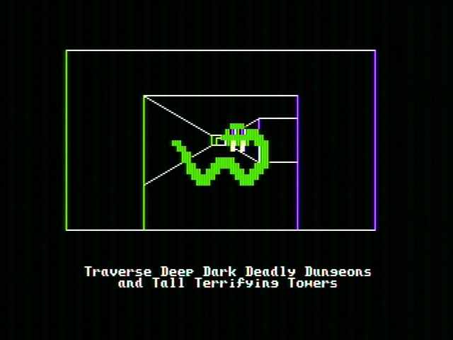
Anyway long story short, as Ultima II shows us above, it’s pink and green, the colors are pink and green. Well, pink is looking awfully purplish today, but that’s the wonder of NTSC. (And the horizontal lines visible on the green snake are the wonder of using square waves and this particular upscaler-capture combo) Notice those horizontal lines also picked up some color– if you want to guarantee white, you’ll need to create a signal with a frequency that isn’t a color carrier. The line above is just one pixel, but two pixels next to each other will do it.
Even if you alternate groups of two pixels, that signal isn’t at 3.579545MHz, so your television won’t be able to pull out any color information from it– it’ll just be treated as monochrome white. Modulo some higher-frequency fringes, after all, this is still good old-fashioned composite video and no filter is perfect. Apple II users got used to some color fringing, or used a monochrome monitor.
Now, unfortunately, there is another catch here. Our addressable pixel areas are 7 pixels wide, which is not evenly divisible by two.citation needed This means that if you have a pattern, x0101010, whether it’s pink or green will depend on its position relative to the beginning of the line. Odd addresses will have one color, even addresses the other. This is why many Apple II games, like Ultima III: Exodus, create a grid of 14-pixel wide tiles that things move about on.
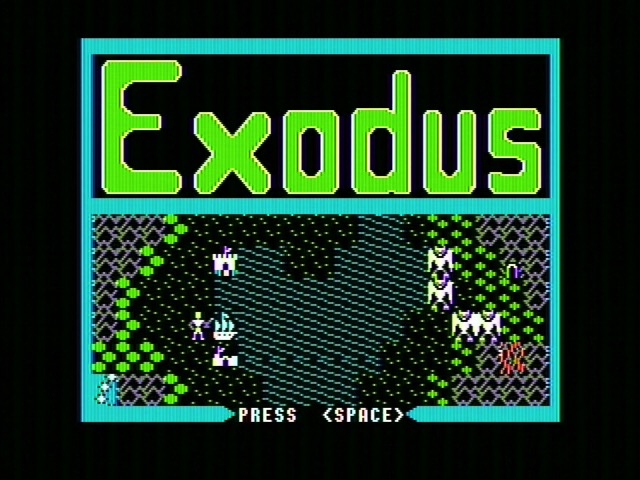
This is still HIRES graphics mode, not a tile-based mode– the developer is just implementing tiles to make their lives easier. And on this title screen they only do so where things will move around in the bottom half.
What’s the big deal?
Now you might have noticed something about the screenshot above. It’s got colors that aren’t pink and green– it’s got blue water, and red lava. That’s true, but it’s only true because my Apple II isn’t a Revision 0. Those early adopters only have a three-color HIRES mode. The rest of us have something better.
Remember that first bit? It’d be pretty wasteful to just leave that unused. This is especially true from the perspective of the video scanner– this bit is fully decoded and just sitting there, waiting to have a use applied for it. What Woz did was have it delay the output of pixels by one cycle of the 14M master clock, breaking the 7M pixel clock, but creating new phase shifts.
This gives us two more phases to work with, 90° out of phase with the pink and green colors we had before– blue and red-orange. But remember, we’re limited to using them within groups of 7 pixels. You can almost think of this as like being able to choose a palette for a 1-pixel high and 7-pixel wide area, except for…
The boundaries
An interesting thing can be seen in this screenshot from Sega’s Frogger. You should now understand why Frogger is white, and why the colored areas are laid out the way they are. But take a look at where the coast meets the water. The green areas and the blue areas don’t quite line up.
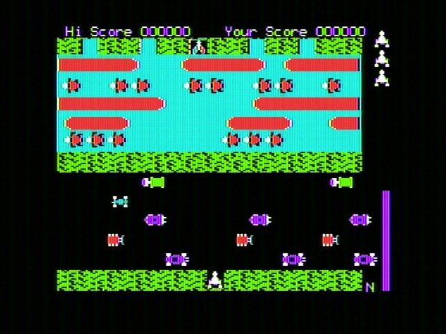
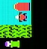
Why don’t they line up? It’s not the developer’s fault, it’s because they can’t. Take a look at what happens if I plug the Apple II’s output into the component luma input on the OSSC. (This is actually how I got most of the text mode captures too, to avoid unnecessary color noise)
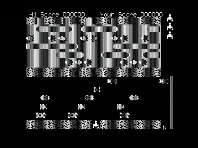
The lines just don’t line up. The Apple II can get you in a mindset trap; of course it can’t line up, you might start to think. But on a system where the luminance and chrominance are set separately, and where it can output analog values, not just 0 or 1, of course it can. On the Apple II, all sorts of weirdness will happen where non-delayed pixels interact with delayed pixels. Say, at the edge of the screen, when we enter the screen border, the seven pixels will be abruptly cut off, leaving a half-pixel at the edge.
Now, do these effects matter? On a CRT, probably not, but you might see some fun color fringes here and there. But if you’re wondering why your Apple II image capture is looking so much worse than your other systems, even over composite? Well, stuff like this doesn’t help.
HIRES is by far the most important graphics mode on the Apple II; more games used it than any of the other options, and even business software used it to do things like implement 80-column text in software. A bit awkward and weird? People got over it. I’ll end this discussion with one of my more nostalgic vintage HIRES intro sequences, from Ultima II. Sorry about the lack of audio; I kept the internal speaker wired up separately when I installed the Mockingboard, and this game only uses the internal beeper.
I especially like the color animation on the “II” from toggling that seventh bit.
Kill it with fire, or a transistor will do
With all the above in mind, text mode should have the same color fringing everywhere that you see in HIRES graphics mode. The pixels are the same size, and Apple didn’t even design the font, so it’d be pretty impressive if it had been optimized to not fringe. But on most displays you’ll see nice pure white in Apple II text mode. How come?
Well, take a look at a screenshot of Mission Asteroid by Sierra. This uses a mixed mode, which I won’t really go into detail on how it works, but basically has four lines worth of text mode at the bottom of the screen underneath the graphics mode. And in this mode, the text fringes quite a bit. All those single-pixel horizontal lines suffer the same problem as the horizontal lines the snake was hanging out in in Ultima II.
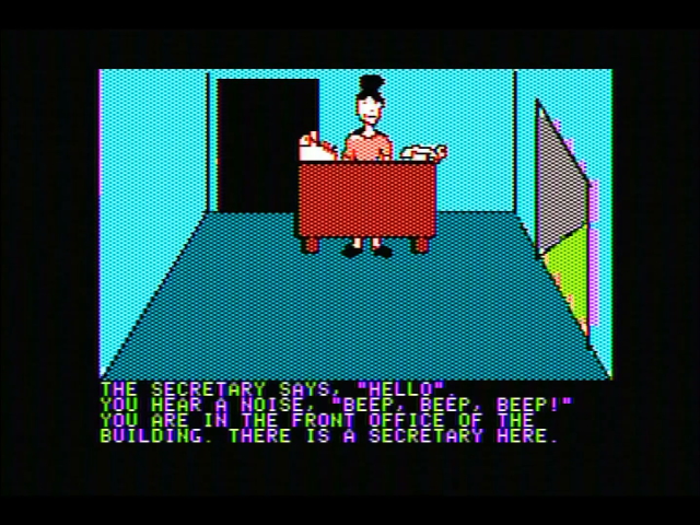
If I had a Revision 0 Apple II, I’d have the same experience with the pure text mode. But I don’t– that’s because later revisions of the Apple II like mine added a circuit called the “color killer”, which removes the color burst when in text mode. In theory, a signal without a color burst should always be interpreted by the TV as a monochrome signal, because NTSC is backwards-compatible. The problem is, the color killer isn’t great– it merely reduces the color burst.
Here’s the signal with the color burst present, which I obtained by booting BASIC and typing HGR.

And here it is with the color burst on, which I obtained by typing TEXT with the same trace showing. I’m kind of surprised this ever doesn’t work, honestly– I guess that little bit of a cycle must be enough to confuse a sufficiently sensitive detector. Interesting, Understanding the Apple II suggests you mod your TV to detect the color burst, only suggesting modding the computer as a last resort, despite the many other computer mods recommended.

This impact for me has always shown up on higher-quality scalers, which are desperate to try to extract a color signal. The color killer works fine on a cheap AV2HD box, but the Micromsoft Framemeister ends up with a fringy mess. Check out my composite scaler competition post for more details on that.
LORES mode
The Apple II’s LORES graphics mode is very impressive. It can display any pixel on screen in any of 16 colors. Well, 15. More or less. There’s two greys that are usually the same. But still, far more colors than HIRES, and with pure pixel-level color selection. So what’s the catch? The resolution is a whopping 40x48. When even RCA Studio II fans think you could use a few more pixels, you’re in trouble.
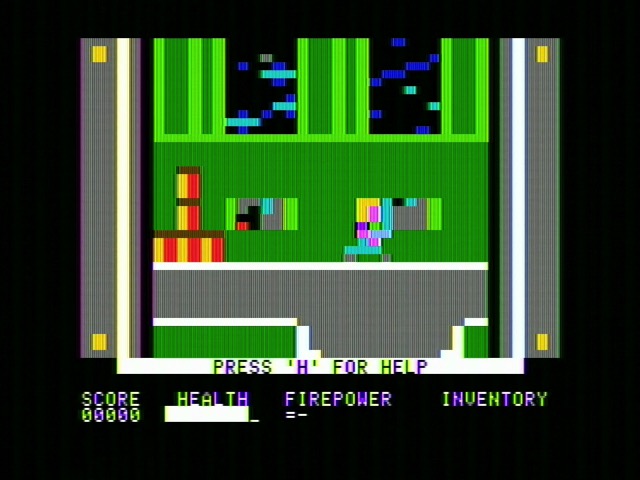
That’s not to say LORES mode is useless. Deater has done quite a few demakes into LORES mode; such a low resolution makes it fast to update the whole screen even doing things like parallax, and the mixed text/graphics mode means you can use text mode for things that absolutely have to be readable, like scores and such.
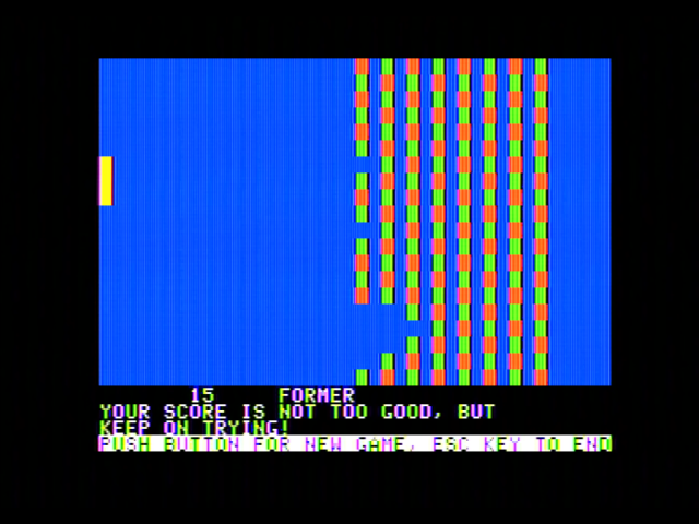
And honestly LORES mode is part of the heart of the Apple II. It’s the mode that Wozniak created so that, having done Breakout in hardware for Atari, he could now do it in software with Little Brick Out. It’s the mode classic business simulation Lemonade Stand used. It justified the rainbow Apple logo. So how does it work?
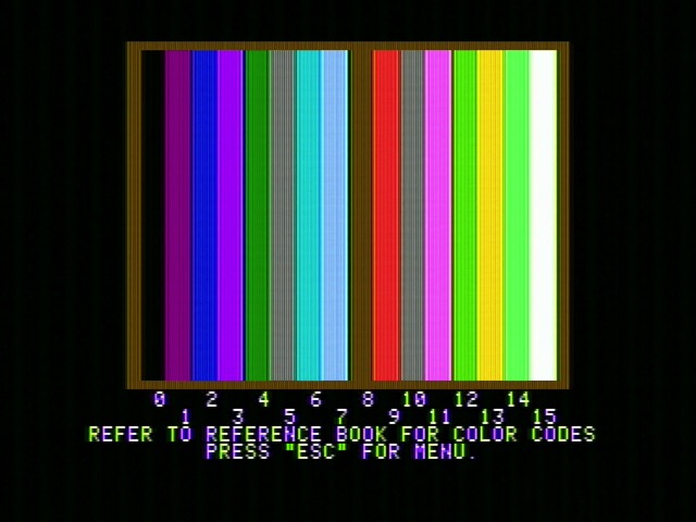
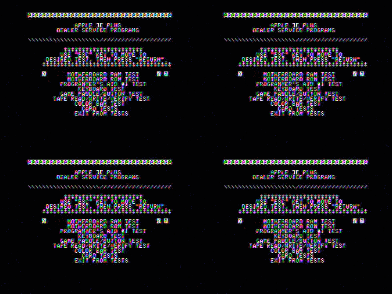
The Koryuu I’m using here has a filter option that kind of blurs everything horizontally; I generally keep it disabled, but it does at least blur the lines together and gets rid of the high frequency noise. Of course, as we’ll see, that noise is the point. By the way, these color bars are from the Apple Diagnostics II+ disk.
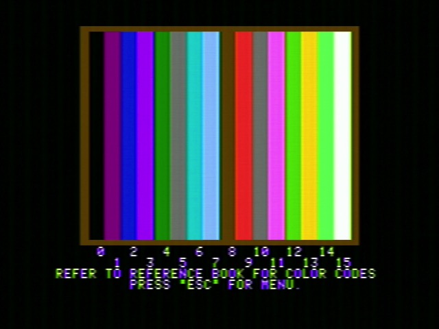
The LORES mode is twice the height of TEXT mode, and that’s no coincidence. The same screen data as text mode is used, with the same layout– the difference is, the two “nybbles” of each byte each become one of 16 colors, stacked on top of each other. A LORES pixel is 7 HIRES pixels wide, and four HIRES pixels tall.
But how does LORES get so many colors?
Notice that for every four cycles of the 14M master oscillator, there’s one cycle of the 3.5MHz color burst signal. So if you repeat a four-bit pattern at the rate of the 14MHz clock, you’ll create a signal with a period of 3.5MHz. That’s all LORES mode is doing to create its colors. Sure, there will be components of the signal at other frequencies– you can see the OSSC trying to show the high-frequency lines, while other devices like an RF modulator might blur the high-frequency signal out into a flat luminance.
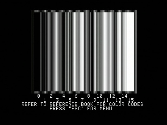
And the repeating patterns? That’s the genius part– they are the nybble in question. Take a look at the chart again. Repeating 0000 over and over again? Of course that’s a pure black. Repeating 1111 again and again? That’s pure white. What are the grey patterns? 0101 (5) and 1010 (10), which alternate fast enough that they don’t really have a low-frequency component, so no color to pick up on. There are two alternating patterns, so two greys. (For homework, consider what happens when those two greys are next to each other)
There is a bit more to it; for example, the phase inversion caused by having 7-pixel-wide slots is compensated for in LORES, but in general this is really a very clever graphics mode. Double HIRES mode on the 80-column Apple IIe uses the same pixel patterns, but that’s a story for another time.
Apple II Forever
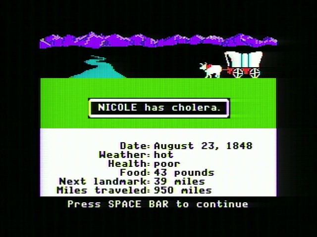
The Apple II is one of the oldest computers I recall using; my kindergarten in 1995 had an old machine they let the kids bang on to avoid them breaking anything new. And yet that computer still fascinates me to this day. I think it’s because it’s not only a useful machine, with a lot of history, but also that despite its rougher edges, it’s something that beckons to be understood. And is well documented to boot. Definitely beats the arcade boards for that.
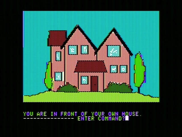
Since Jim Sather’s book was crucial to the completion of this blog post, I think it’s only fair that we end with a quote from Understanding the Apple 2.

Jim Sather is in way cooler circles than me.
