Royal 240: The Beginning of the End for the Typewriter
It’s 2026. You can put on VR goggles, consume content all day that was generated by artificial intelligence, and never have to care about the physical world at all. So to combat this, let’s look at something totally physical. Something that doesn’t even have a power cord. We’re looking at a typewriter. And because this is Nicole Express, it’s from 1970 and has fake wood paneling. Let’s get classy.
It’s in a box
We’ll start with the typewriter still in its case. The Royal 240 is an “ultraportable” typewriter– as far as I can tell, there are three main form factors:
- “Standard” typewriters. Everything from the Underwood No. 5 to the IBM Selectric. Big, heavy, serviceable, but designed to spend their whole lives stationary.
- “Portable” typewriters. Despite the name, these are the “desktop replacements”, they can be moved but still not that light. Most home and small business typewriters.
- “Ultraportable” typewriters. Anything designed to be carried around. In this era, expect a lot more plastic, and a lot of sacrificed features. The Macbook Air of typewriters.
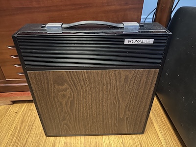
But there’s a fun thing about the case. See, Royal made a lot of models using this basic form factor. And on the higher-end ones, like the Royal Fleetwood, there was actually an AM transistor radio in the case! You could take your typewriter to the park, listen to an annoying talk radio host, and type up your angry response letter to the station demanding they be fired, all without needing to bring anything extra beyond paper. Convenient! I don’t have that though.
Now let’s take it out of the box. With the red platen knob, the flat design, shiny chrome carriage return lever, and the fake wood ribbon cover, this is a really striking model.
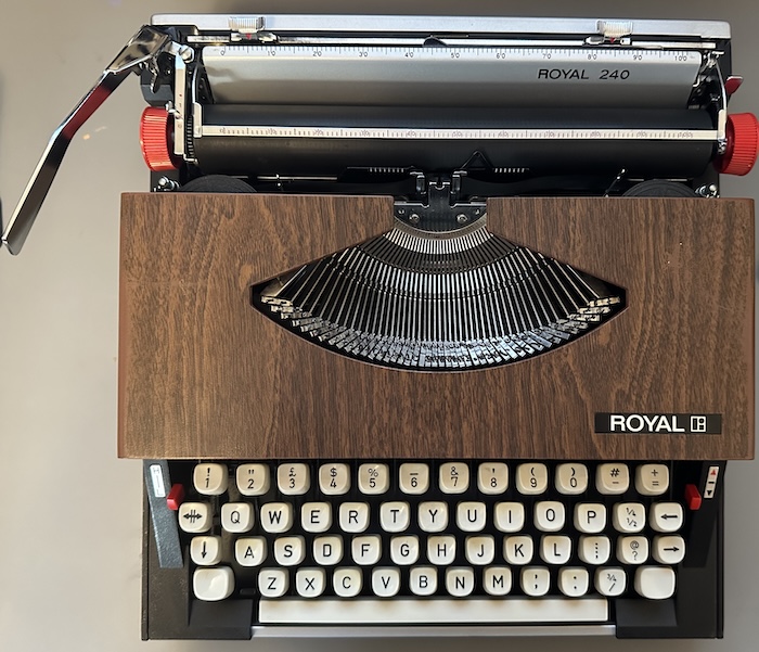
Interesting, I suspect this might have been an overseas model. While it’s just the 26-character Latin alphabet with an English QWERTY layout, most US models from Royal I’ve seen differ from this in two ways.
- They tend to have names, rather than numbers.
- Keys tend to be labeled with names, rather than icons. For example, this arrow icon means “margin release”, but if you look up a US-market Royal Fleetwood, it says “MAR REL” instead.
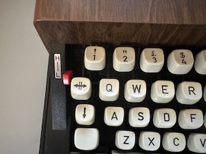
Judging by the pound sign, perhaps this is a British or Irish model? The seller was in Texas, but that means very little; I assume if it was a Latin American model it’d have some way to type ñ. In general, typewriter manufacturers did not limit their SKUs; across the board there are a lot of variants and models.
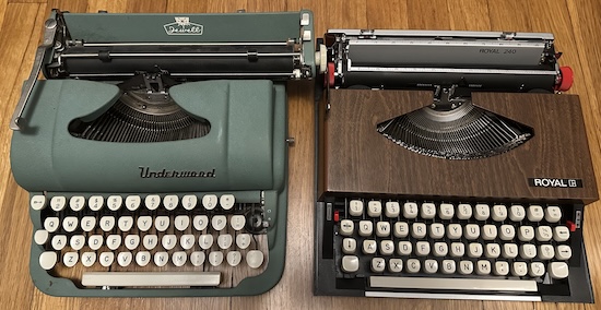
To better understand the difference between a “portable” and an “ultraportable”, here is my Royal 240 side-by-side with my wife’s Underwood Jewell. Of course, the Jewell was a pretty small portable, but you can hopefully see how it’s much taller. What you can’t see, but what I could feel, is that the Jewell is a 1950’s bit of American iron. That thing is heavy.
Mechanism
It feels worth doing a quick overview of how a manual typewriter works. The Royal 240 is a typebar machine; this means that the characters are embedded on the surface of individual arms. And being a manual machine, all of the energy used comes from you, the user.
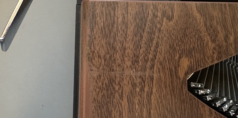
The first thing you do is push back the carriage, the moving segment. On typebar machines, the typing mechanism is stationary and the paper moves. This carriage return not only puts the paper where you want it, but charges a spring with energy, that will later be delicately released. The Royal 240, and similar machines, has a design flaw: the carriage return arm can easily be pushed down while doing so, and given the arm is metal and the ribbon guard is plastic (so shocked it’s not real wood), scratches it. Thankfully it’s subtle.
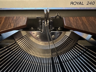
When you type a letter, a bunch of things happen. The arm for that letter moves towards the paper. The ink ribbon is lifted up into position. This requires a bit of finesse; your finger press is directly converted into the inking of the paper. And then, after the paper is inked, the spring energy is released just enough for one character’s width. It also advances the ribbon slightly. It’s very elegant, though it’s worth noting that there’s nothing special about the Royal 240 doing it, especially not in 1970.
The typebar mechanism is proven, can be manufactured efficiently, and was the dominant typewriter mechanism for the bulk of the 20th century. It was proven, reliable technology. And in 1970, it was coming to an end. A decade earlier in 1961, IBM had released the Selectric, which used a rotating typeball design, which promised no jams and easily changeable typefaces. And in the 1980s, the typebar would be essentially completely supplanted by the daisy wheel. That’s mostly to say that in 1970, this was a proven, reliable, uninteresting mechanism.
Between the heavier and specific keyfeel required, and the careful pace you need to go at to prevent the typebars from jamming, typing on a manual typewriter like this really is quite a bit different from typing on a keyboard. Worth noting that this H-L lever next to the margin release actually allows some control over the keyfeel, allowing you to tune it a bit.
Now let’s consider what this typewriter doesn’t have. It doesn’t have any sort of tab key functionality at all. There are no rollers on the paper bail (the thing that holds down the paper). There’s only one stem to prop up the paper as you write, rather than two. The shift is implemented by moving the carriage and thus the paper (a “carriage shift”), rather than by moving the typebars (“basket shift”), as on some other typewriters.
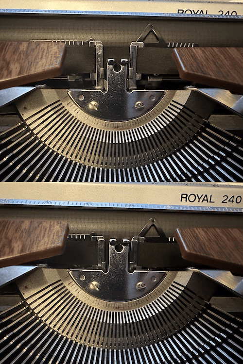
Indeed, the basket shift was strongly associated with Royal’s own standard-size typewriters. But then again, this isn’t a standard-sized typewriter, and it isn’t really a Royal either.
The story we all know
I think most people in 2026 are aware of the phenomenon of “zombie brands”; brands that didn’t actually produce an object, but put their name on it. I used to have a Westinghouse television, which had absolutely nothing to do with the entity founded by George Westinghouse beyond a name. (That’s what I was using when these pictures were taken) The TV was fine; my understanding is that Westinghouse Digital’s business model was “put a recognizable name on Chinese TVs, as Americans won’t recognize Chinese brands”.
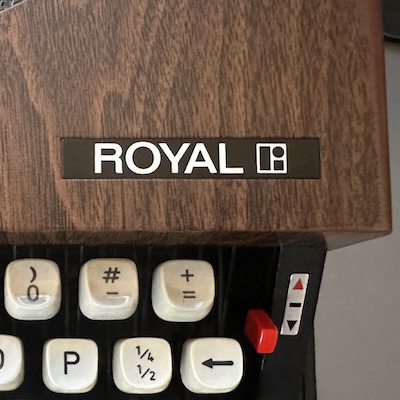
Today, the Royal Typewriter Company (or, to use its modern name, Royal Consumer Information Products, Inc.) still sells typewriters. But it’s a zombie; the typewriters in question are just rebadged from Nakajima. And our Royal 240, from over fifty years earlier, is the same exact situation.
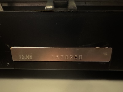
A bit annoyingly, this typewriter doesn’t actually have any information on the back explaining where it came from; other Fleetwood-types I’ve seen only clearly state “MADE IN JAPAN”. Because in the 1960’s and 1970’s, Americans didn’t recognize Japanese brands, and associated Japan with cheap garbage. Just like the Chinese television companies decades later, they wanted to get in the US typewriter business, under a brand consumers would recognize.
Specifically, these typewriters were manufactured by Silver Reed (also known as Silver Seiko), a Japanese firm that started out making knitting machines, but never really found a way past the typewriter market and finally collapsed in the early 2010’s.

You can see what looks like an “ER” ligature on the type hammers. I’m not sure what this means; I know that #112 is the font that’s being used here. The ER looks kind of like the ER in this vintage Silver Reed logo from the 1970’s, but I’m not sure this logo was in use already in 1970, and also using a random ligature from the middle of your logo as an identifier is questionable.
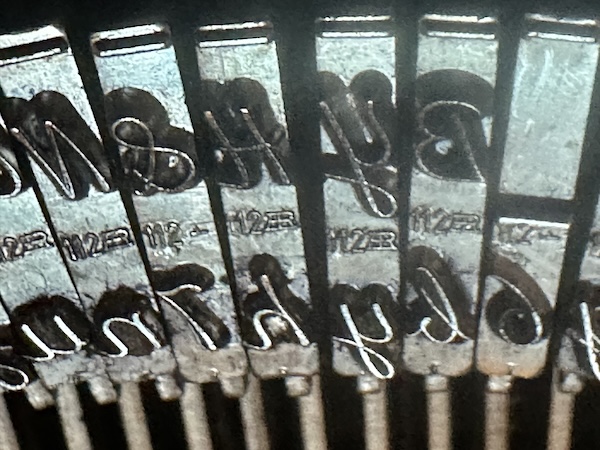
But hey, there’s something else about that font…
Scripting
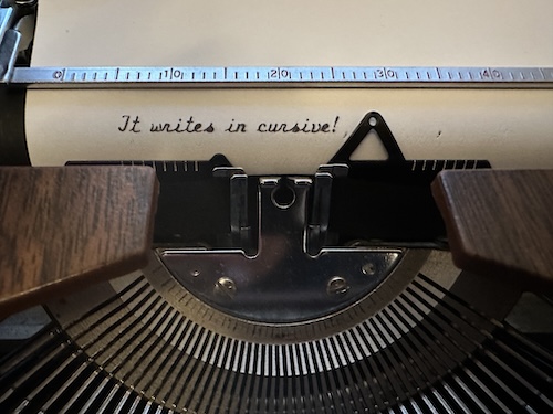
That’s right, this writes in cursive! Well, sort-of. A skilled user of cursive would note that letterforms can vary based off of letters around it, and this typewriter can’t do that. Instead, this typeface is usually called “Script”. It’s functionally the same as a normal typeface, it’s just prettier.
Why would you want a cursive-like typewriter? Well, people wrote more personal letters back then (long-distance phone calls existed, but were expensive), and typewritten text was seen as a bit impersonal compared to writing by hand. And back then, handwriting was always in cursive. So if you wanted the convenience of a typewriter, wanted your letter to appear more personal, and had enough money for a spare typewriter (hey, these cheaper imports might fit the bill) it was a decent solution.
Of course, they’re way less common than the normal typewritten “Courier”-style. That makes them a fun collectible for modern typewriter users. And I’m told the modern typewriter community is growing; why do people want to go back? Who knows; perhaps it’s because you know anything written with a typewriter is extremely unlikely to be AI.
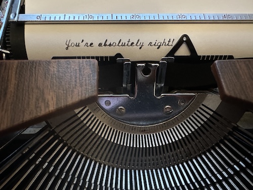
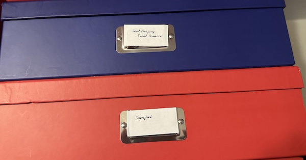
While I wouldn’t use it to write the Great American Novel, I think the script font makes this a lot of fun to mess around with, even if it’s not any different than a more normal typewriter in operation or how it works. Writing cute letters, or labels for the scrapbooking boxes I store my arcade PCBs in. Don’t expect the typewriters to take over this blog like the arcade or mahjong stuff did, though. Probably need to clean the typebars, though.