Composite Video on the NES: Why's it so wobbly?
The Nintendo Entertainment System. Is it the platonic ideal of an 8-bit video game system? Well, only because it’s so prominent and successful– it’s actually kind of an oddball in its expandability and design. But there’s something else about it. The picture is a bit… wobbly. Well, over composite video anyway. Let’s dig in and learn a little big more about the nitty-gritty of composite video.
Not so mighty now, are you
Mighty Bomb Jack, the most iconic bomb-collection platform taking place in a pyramid for the Nintendo Entertainment System. The title screen here, like a lot of title screens, is entirely static. But here, I’m using my composite-modded system, which just amplifies the video signal coming right off of the PPU, and the picture is wobbly.
And you might be tempted to say, now wait a second Nicole, this is composite video. You wrote a whole post on it! Composite video is inferior to other signals because it’s basically a form of video signal compression. And that’s true; but there’s no reason a composite frame should differ from frame to frame, is there? Here’s my beautiful Apple ][ running Shanghai (as referenced in a recent post).
That’s incredibly static!
Explanation Attempt 1: Interference
Interference isn’t actually as big of a problem as you’d expect. It’s probably something you’re thinking about, but interference would generally present as a random pattern, not the cyclic noise seen on the NES screenshot. In fact, the Apple video was captured using a much longer cable, being strewn over my desk where several electronics were running, and you can actually see some noise in the white parts of the image. But it’s noise; it’s uncorrelated to the input signal.

This is the letter “B” from Mighty Bomb Jack above, cropped from the raw capture. Notice the repeating jagged pattern on the left side of the letter “B” where the white meets the blue of the sky. If this was just signal interference from outside, there’d be no reason to expect it to follow the images that closely.
Explanation Attempt 2: The colorburst
If we divide the colorburst frequency of ~3.57 MHz by the NTSC linerate of 15.734kHz, we get a near-exact 227.5. That’s no coincidence; RCA deliberately aimed to have the color carrier a half-integer multiple of the linerate. That’s because if one scanline is similar to the next line, it’ll be a signal with a frequency similar to the linerate. It’s very rare, on the other hand, for the television signal to have components that are a half-integer multiple; so this makes it easier to filter out the color signal. I talked about this a bit in my 2021 post.
You might notice something here. The colorburst is expected to just be a portion of a continuous 3.57 MHz signal. That’s signal doesn’t fit evenly into the line frequency; so as a result, the colorburst should not be the same on every scanline. Could that be the cause of our wobble?
On the Apple, on the other hand, Woz noted it’d be very hard to use his HIRES mode if the pixel arrangements different on every other scanline; differing in every other byte on a single scanline is hard enough. So in this rare case, he took pity, and included extra hardware to stretch the clock cycle; on the Apple, the line rate is altered such that it has 228 color cycles. That is to say, it breaks RCA’s optimization, and allows the luminance to more easily interfere with the chrominance. Which is what artifact color is, after all.
So the Apple was a bad example. Another console with 228 color cycles per scanline is my Japanese Sega Master System, even though it’s seen as a more compliant signal in other ways. It was actually surprisingly hard to find a Master System game with a static title screen without a black background; I went with Ace of Aces.
Where you do see variation in scanline artifacts is in scrolling. Look at the ground in the Alex Kidd in Miracle World shot above. Look at the ground, and the artifacts on the ground in particular– where the artifacts are varies from frame to frame; or it’s more accurate to say, remains constant, while the ground moves, producing a shimmering effect.

What does a system that actually has 227.5 color cycles per scanline look like? Well, the PC Engine! (or, in this case, the SuperGrafx, but that shouldn’t matter)
This might be even more obvious if we zoom in a bit. Here’s a screenshot from the title screen of Space Ava 201– it happens to be in SuperGrafx mode, which seems to have more noise for some reason, but we’ll ignore that today because this is extremely zoomed in.

Look especially at where the blue background touches the yellow letters. Kind of hard to see through the video capture macroblocking, but every other pixel is slightly off. That’s because the color resolution is lower than the pixel resolution.
But compare it to the “B” above– the NES has a three-line pattern, not a two-line pattern. Intriguing.
Explanation Attempt 3: The NES is different
The Sega Master System is a natively RGB animal. Its VDP doesn’t have a composite output; it outputs only an RGB image, which an external chip encodes to composite video. My French Master System 2 doesn’t even have that encoder, and as a result can only output RGB. We might say this is the norm for video game consoles, at least those from the latter half of the 1980’s onwards. The rainbow banding in the Master System screenshots above come from the Sony CXA1145 video encoder, and might be different if you used a different encoder.
The Famicom is a creature of the early 1980’s. It does not have a separate video encoder, and it actually never acts in RGB. The PPU doesn’t just output a composite video signal, it also works in that domain throughout, or with digital video data that isn’t color encoded at all. The lack of the RGB intermediary is what makes getting RGB out of the Famicom a bit complicated.
What does this mean? Well, take the NES palette (please!). This one’s FirebrandX’s “Digital Prime”.

But why did we need to credit someone with the palette? Because this is an RGB PNG image, and the NES knows nothing about RGB. As you can see, there are four different brightnesses (that last column’s a little weird), and there are twelve different hues. The first column has no hue; that’s just raw brightness. The NES internally translates directly from palette indices to these hues and brightnesses; it doesn’t even have an S-Video intermediary, let alone RGB.
The Atari 2600 works in a very similar way, but does have an S-Video intermediary, and has sixteen different hues to boot. So why does the NES only have twelve?
The NES has a 21.47727 MHz crystal oscillator, which is exactly six times the colorburst frequency of 3.579545 MHz. The PPU can do a trick where it uses both the rising and falling edge of this clock when generating the color signal, so it has access to a base rate twelve times the colorburst frequency– and so, twelve possible phases come out of that pretty naturally.
And now we start to see where the NES gets its timing from. The NTSC Famicom only has a 21.47727 MHz oscillator. Every other clock is derived from it; divide that by twelve and you’ll get a beautiful 1.7897725MHz clock speed for the 6502 2A03. Within the PPU, the master oscillator is divided by four to get a 5.3693175MHz dot clock, and each scanline is 341 dots (including the horizontal blanking interval), giving us a linerate of 15.7458kHz. Close enough for government work.
And now we see the trick. The relationship between the divided-by-six colorburst frequency and the divided-by-four pixel clock gives us an awkward 227.33 colorburst cycles per scanline. And that’s why we have a pattern that seems to repeat every three lines. Now we understand the B.
But let’s look at that title screen again. It seems like it’s alternating between two frames, not three. Why?
Ricoh’s engineers noticed this relationship between the line rate and the colorburst meant that across 262 scanlines (including the vertical blanking interval), you’d end up with a three-frame pattern of possible colorburst/scanline alignments. Apparently, this was unacceptable– on NESdev, you can see a good diagram by user lidnariq on how this could produce a moving diagonal pattern across the screen.
Instead, the NES does what might described as the world’s laziest interlacing. In interlacing, the last scanline between fields is half the length of a normal scanline. On the NES, that scanline alternates between 341 dots and 340 dots, a “missing dot”. Effectively, this means that you only see two of the possible three alignments, which alternate every other frame, thus creating an effect superficially similar to something with the “proper” 227.5 giving two possible alignments.
It’s worth stressing again that all of this is only true for the NTSC console. The PAL console naturally has a completely different timing system, with a different master oscillator and different divisors– and it doesn’t bother with the missing dot shenanigan at all. Still, the attention to detail here is impressive. The PPU is really an impressive machine for its time!
Rare is the exception
Another edge case of the missing dot is that it only occurs when the PPU is actually rendering; if both background and sprite rendering are turned off, then the PPU won’t bother; I’m not sure why, but if I had to guess, maybe just due to some implementation detail. A screen rendering nothing isn’t going to have anything complex on-screen that would show artifacts.
Now, why would you want to turn off the screen? The PPU, for all its merits, has a major flaw: during active screen rendering, you can’t write to video RAM at all. Instead, you have to batch your writes to occur during the vertical blanking interval. But if you turn off rendering, the PPU gives full access to the video RAM all the time; this is especially convenient if you’re using CHR-RAM, and need to upload all your tiles into on-cartridge RAM.
One game that does this is Rare’s Battletoads, one of their AxROM games. It goes further than most– in order to get the maximum amount of CHR-RAM access time, it turns off rendering every single frame, using careful timing to turn it back on after a few blank lines that can squeeze out a few more tiles for more animation. Let’s take a look. This isn’t the title screen; it’s in-game, but much of the screen is still stationary. Just ignore my toad getting beat up, I’m sure he’s fine.
It’s a little more noisy sure, but to confirm that’s really what’s happening, here’s a bit of the HUD from four adjacent frames. Like in Alex Kidd in Miracle World above, you can really see the effect in the rainbow banding, which in this case shows up on the partial heart– we are basically looking at a snapshot of the colorburst at this dot.
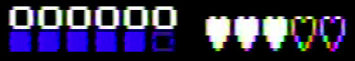


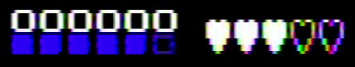
Notice the first and fourth images are near-identical; this is a three-frame repeating pattern, exactly what the missing dot was supposed to cover for. Rare does it again.